
AI Dashboard Generator: Describe Data, Get Visualizations
AI Dashboard Generator: Describe Data, Get Visualizations


Every Dashboard I’ve Built Has the Same Problem
Here’s a story you’ve probably lived. You join a project, and someone asks for a dashboard. You spend a few days figuring out the data source, writing API calls or SQL queries, choosing chart types, wiring up data mappings, tweaking the layout, styling it. You ship it. Everyone’s happy.
Two weeks later, someone wants different metrics. The team pivots to tracking something else entirely. You rebuild half the dashboard. Then the other half. Then you start wondering why you’re spending more time maintaining visuali
zations than building the product itself.
Charting isn’t the hard part. Libraries like ECharts or Recharts can render beautiful charts from a JSON config. That’s a solved problem. The hard part is everything around the chart: the manual mapping between “what I want to see” and “how to fetch and display it.” Figuring out the right API call, extracting the right fields, choosing the right chart type, mapping data to axes, laying it all out. That’s where all the time goes, and every time a requirement changes, it breaks.
I kept running into this, and at some point the question shifted: what if I could just describe what I want to see, and the system figures out how to get it and show it?
That question is what led me to build Mystique.
Let the Model Do the Mapping
Charting libraries already speak JSON. ECharts takes a JSON options object. Grafana dashboards are JSON files. This isn’t new. What’s new is that language models have gotten good enough at structured output to generate these configs reliably from natural language.
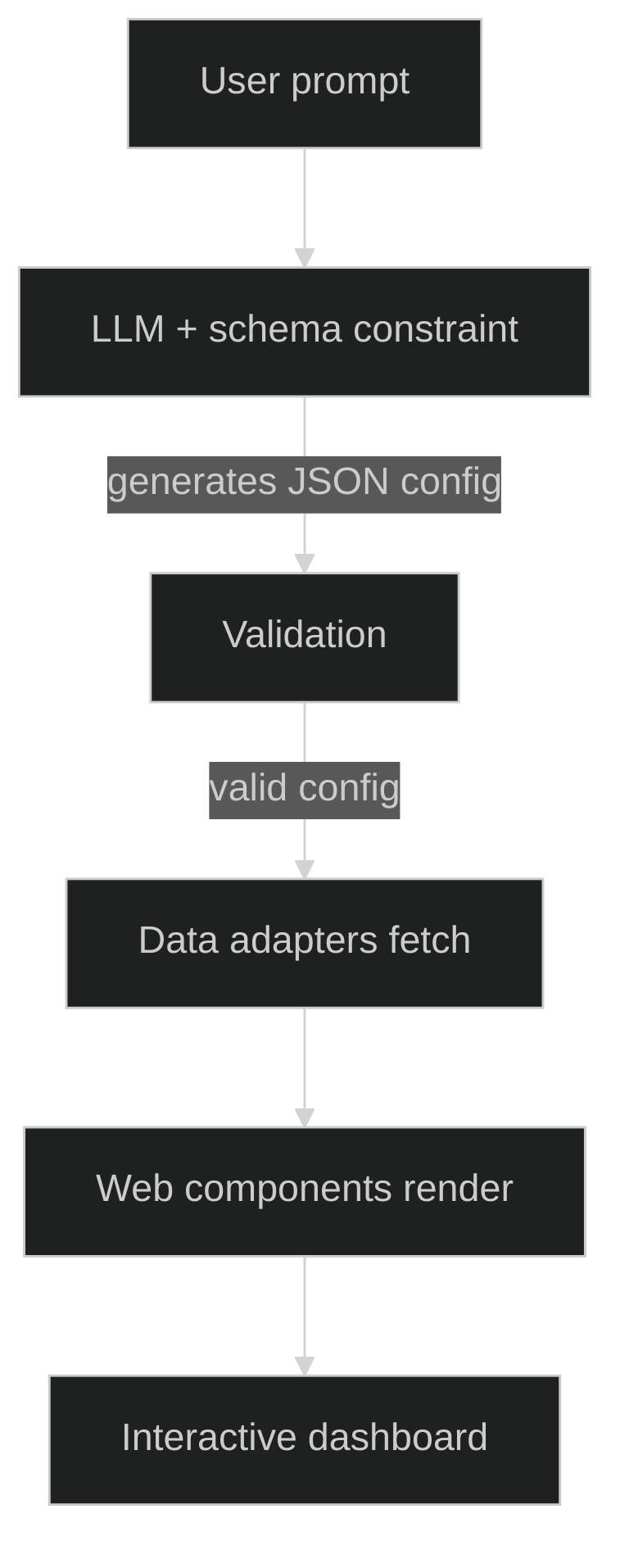
That’s the entire idea behind Mystique. You describe a dashboard in plain English. A language model generates a valid JSON config: which APIs to call, what fields to extract, how to map them to chart axes, what chart types to use, how to lay it all out. The config gets validated, the data gets fetched, and the charts render.
The model doesn’t just pick a chart type. It figures out the entire pipeline. When you say “show me product prices and ratings,” it identifies the right API endpoint, determines which response fields to visualize, decides whether a bar chart or scatter plot fits better, maps fields to x and y axes, and arranges everything in a responsive grid.
The key mechanism that makes this reliable is structured output. I’m using the Vercel AI SDK, which lets you pass a Zod schema to the language model and constrain its output to conform to it. The model can only produce JSON that matches the contract. This isn’t a “generate some JSON and hope it parses” situation. The output is structurally guaranteed to be valid.
To help the model produce good configs (not just valid ones), I use few shot examples in the prompt: natural language descriptions paired with high quality dashboard configs that teach the model what good looks like. The temperature is set low, 0.2, for consistency.
Watching a Dashboard Build Itself
The part that really sold me on this approach is progressive streaming. In the demo application, the AI doesn’t generate the entire config and then render it. The config streams in token by token, and the dashboard renders as the AI thinks. You type a description, hit generate, and charts start materializing on screen while the model is still working.
This required a bit of care. You can’t render half a config or you’d get missing chart references and broken layouts. So there’s a guard that checks whether enough structure has arrived before attempting to render. It waits until the config has at least one complete chart with field mappings, a data source with a URL, and a layout position. Only then does the dashboard appear. As more charts stream in, they fill the grid progressively.
The experience of watching a dashboard build itself from a sentence is surprisingly compelling. It makes the abstract idea, “describe what you want, get a visualization,” feel real.
Dashboards That Don’t Need to Exist Forever
This is the paradigm shift I’m most excited about. If the AI can reliably generate valid configs from descriptions, then dashboards become disposable. You describe what you need right now, you get it right now, and you discard it when you’re done. No maintenance burden. No stale metrics. Just a fresh answer to a fresh question.
When you say “show me product prices by category,” you’re expressing intent, not writing configuration. You don’t need to know the API schema. You don’t need to know what chart type works best. You just need to know what question you’re trying to answer.
Today Mystique works with REST APIs. The architecture uses pluggable data adapters, which means SQL and database connectors are the natural next step. Imagine describing “show me monthly revenue by region” and the AI writes the SQL query, fetches the data, and renders the chart.
Have questions or want to discuss potential collaborations? Feel free to reach out in the comments below or connect with me directly!